American Parkinson Disease Association (APDA)
Wisconsin Chapter
Accessibility | Information Architecture

Role: UX Researcher|Designer
Current website: https://www.apdaparkinson.org/community/wisconsin/
Tools Used : Mural and Figma
Audience, mission, and vision
The users of the American Parkinson Disease Association Wisconsin Chapter site consist of local volunteers, donors, and people with Parkinson’s Disease. Hence, our users span a wide range of ages and levels of computer literacy, and also come with very different sets of goals. For our redesign project, it will be important for us to capture the needs of all of these users and make clear to them which content will help them achieve their goals. Our mission and vision for this redesign is to increase the accessibility, discoverability, and ease of navigation of the APDA Wisconsin site.
Research and Analysis
Content analysis
We performed high-level content mapping of the American Parkinson Disease Association (APDA) website revealed content targeted toward people with Parkinson's Disease (PD), APDA volunteers, and donors. There doesn’t seem to be a clear hierarchy of the information, interspersing content for people with PD, volunteers, and donors with a clear journey designed for any particular user.
The site has a global navigation system as well as several supplemental navigation menus. The menus contain repetitive and vague links, making it slightly difficult for users to confidently navigate the site. Developing personas and journey maps will help identify the most important content for each user and make decisions about which content should be included on the homepage of the site.
User analysis and contextual inquiry
To understand the high-level performance of the website, analysing visitor information analytics is the place to start. Using an online user analysis tool, we discovered that
-
there is an average of 9% month-over-month decline rate in visitors.
-
We also found that the highest number of visitors is of those age 25-34, and the fewest number of visitors are at least 60. This site is not only intended for donors and volunteers but also intended to help and guide people with Parkinson’s. Data shows that, mostly, Parkinson’s is developed in people over the age of 60, which implies that this website needs to be re-designed in such a way that it is accessible to the elderly.
-
User analytics also show that the bounce rate of the website is 64.28%, which means the majority of visitors exit the website after viewing just the first page.
After performing contextual inquiry, below are the observations-

Card Sorting
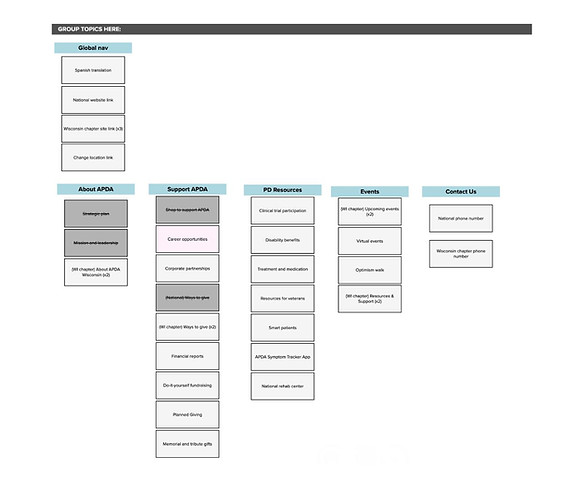
Our stakeholders and users have all mentioned the design of the navigation on the APDA website—they have reported duplicate content and a lack of clarity on the destination of some links. We used the card sorting method in Mural to help us make decisions about the architecture of the site’s navigation systems.
A few common themes arose—each of us created many of the same categories.
It was in our discussion of the card sort results that we agreed that we needed to refine the resources that are being listed from the Wisconsin APDA page, eliminating a significant amount of redundancy and adding some clarity as to the destination of the links.
We believe this will help with our goal of keeping menus simple and supporting less complex navigation for people with less experience with computers.

Card Sorting in Mural

Came up with a high level site map based on our card sort
Site Map designed on Mural

Wire Framing
With our research and Information organisation study, we narrowed down to three major goals-
-
Make the navigation and discoverability effortless
-
Eliminate redundancy
-
Reduce the amount of text as much as possible to make the information simple.
With these goals in mind, we created Hi-fidelity wireframes on Figma for - Home, Resources and Events pages.
Before
After


Made the important pages easily find-able by adding the buttons and menu options on the home page and with clear classification without redundancy
Before
After


Separating the resources and support into 3 categories to help navigate the required information without confusion and getting lost.
Also worked on lowering the text clusters to make it not tedious and overwhelming to go through all the paragraphs.
Before
After


Finding a disorder specialist should not be a treasure hunt as that is what this website is all about in the first place.
-
Added a button on the home page
-
Introduced "search by zip" search bar.
Before
After

Removed the confusing promo and added the details of events directly with a register and more info button.

