

UX Research+Design
Fandango
Fandango is a popular movie ticketing app that enables users to discover, purchase, and manage movie tickets from their mobile devices
Short on time? Here's a quick PPT with highlighting all my design process
But highly recommend to scroll through the whole case study
"Redesign Fandango to prioritise group planning and enable users to book movie tickets seamlessly and efficiently, creating a personalized and enjoyable experience for groups of movie-goers"
Story
Intrigued and curious about why my friends were consistently unhappy with Fandango despite it being a popular app for booking movie tickets, I decided to take on a case study.
Role
UX Researcher | Designer
Tools
-
Qualtrics
-
Miro
-
ATLAS.ti
-
Canva
-
Figma
-
Competitive Analysis
-
User Interviews
-
User Journey
-
User Persona
-
Brainstorming
-
Storyboard
-
Sketching
-
Prototype
-
Mockups
Competitive Analysis


Research data


Features comparison Matrix


Fandango
AMC

User Interviews and Survey
For the interviews, I recruited diverse participants, including frequent movie watchers, occasional watchers, and Non-native English users. All these users are a mix of both Fandango users and non-users. After 8 interviews, I observed a pattern in the responses.
Discoveries
-
Perks exist in the form of VIP points but the process to redeem is not straightforward
-
Partner rewards can be redeemed (AMC stubs for example) but more than 90% of the users are unaware of the feature
-
62% of non-users presume the prices are higher (which is not and we saw that in previous research)
-
Revalidate the distance time and travel time
-
presents a challenge when it comes to finding movies that are not in the English language.
This suggests that the low experience rating is not attributed to a lack of features, but rather to the inaccessibility of most of the existing features.
User Journey

User emotional journey
After listening to the users, I wanted to observe them in their habitat while they book tickets as actions and expressions convey what might have been missed in words.

User touch points throughout
This exercise validated my previous research inferences.
-
Users tried to search with the language of the movie but unhappy with the results.
-
Users feel disappointed to not find their favourite movie on the home screen.
-
Users toggle between apps through out the process (like maps and messenger apps) for more details and planning.
-
Users are stressed to take screenshots of the tickets before they exit the website and share
the plan with friends.
-
Users feel apprehensive to inform their friends about the ticket price.
Persona

Gender: Male
Age:30
Marital Status: Married
Job: Lead Business Analyst
Income:$100k
Lives In: Philadelphia
Aravind is a Lead Business Analyst who loves his job and life to be slow and satisfying. He loves to watch movies almost once a week. Sometimes he watches a movie on a weekday after work hours. He has a choice neither in the genre nor in the language.
"Movies are my second home"


Brainstorm
"How might we make the ticket booking experience personalised, and make the group plans an enjoyable experience "


Through a productive brainstorming session, I developed an innovative concept to streamline the planning process for Fandango users by integrating a user-friendly chat feature.
Story Board Sketches Prototypes Mockups
Story Board
To translate my ideas into tangible visual representations, I began with storyboards, which helped me to visualize the user flow and the various touchpoints that the user would encounter throughout the experience.


The storyboard is my first step towards creating task flow and prototypes!

Screen Sketches
Once I had a clear understanding of the user journey, I moved on to creating screen sketches, which allowed me to explore different layouts and design options.


Paper Prototype

From there, I created a paper prototype, which was a rough, low-fidelity version of the design that I could use to test and refine the user experience.


WireFrames
Following the paper prototype, I moved on to creating lo-fi wireframes. These are rough, basic representations of the design that help to convey the structure and content of the design without focusing on visual details.


Heuristic Evaluation

Maintain consistency
Add "Plan It" on other screens
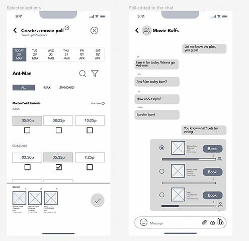
Enable poll with multiple movies
Add accessibility filters

Final design decisions
Introduced an in-app chat feature in Fandango that allows users to share movie recommendations and discuss showtimes with their friends and family directly within the app. This enhances the social aspect of the app.
By including travel time information in addition to distance, the need for users to switch between maps and Fandango was reduced.
By adding the movie review rating on the home page, users can quickly make more informed decisions
Including language filters in search results enables users to more easily find movies that matched their preferred language, resulting in a more personalised and relevant movie search experience.
Enabling shareable tickets at the end of the purchase process, along with the ticket price, addresses a common apprehension some users may have had about discussing the cost of movie tickets with friends and family
Hi-fi Mockups
After testing the lo-fi wireframes, I moved on to creating hi-fi mockups. These are more polished versions of the design that incorporate more visual details, such as color, typography, and imagery.
Sans-Serif, Geometric
Avenir (Black)
Headings
16
#FF7300
#9B74C2
#3B3F45
Sans-Serif, Geometric
Avenir (Heavy)
Sub-Headings
14
Sans-Serif, Geometric
Avenir (Medium)
Body
12
Sans-Serif, Geometric
Avenir (Medium)
Body
11


Added Movie review ratings under the movie poster on the Home page and all other pages
Plan-It Icon for the new social feature.
Fiiter with various options
The new Chat feature
Voting feature to make the planning fun and easy
Users can choose multiple showtimes to add to the poll
Users can navigate to the seat selection page from the chat screen itself
Users can update the date, showtimes and no.of seats from the seat selection page itself.
A shareable ticket
Add to favourites button on home screen

Learnings and Takeaways!
User research guides design decisions
Through the process of conducting a heuristic evaluation and continuous testing, I gained a deeper appreciation for the value of user-centered design.
By involving users at every stage of the design process, I was able to identify pain points and make improvements that directly addressed their needs